Daliogne Catering
From Catering to Creativity: How Building My First Website Ignited a Passion for Design
Project Type: Brand-new business website (self-initiated for our catering company)

Project overview
Back in early 2007, I launched Daliogne Catering — a family-owned venture in the local food-service market. While the business itself represented fresh beginnings, what truly stood out was how I leveraged it as a design playground: I built the company’s first website entirely by myself, diving head-first into web design, UX and brand identity. The main challenge was two-fold: to establish credibility and brand presence in a competitive catering landscape, and to create a digital space that captured the company’s unique flavor (a Creole-inspired twist) in a visually compelling way.
Role: Sole designer, content strategist, webmaster
Deliverables: Fully-designed responsive website using Wix + design system (colors, typography), site map/user flow, usability test & iteration report
Tools: InDesign, PowerPoint, Wix
Industry: Accommodation & Food Services
Duration: 3/1/2007 – 3/3/2007
Objectives
The website needed to speak to event planners and couples looking for catering with style, ease of contact, and confidence in service — all while staying rooted in authentic, personal brand voice.
-
Clearly present menu offerings, service types, and pricing in an accessible, user-friendly format.
-
Enable prospective clients (especially brides, event planners) to easily contact staff for quotes and ask questions.
-
Create a brand aesthetic that balanced elegance and cultural authenticity.
The website boosted our business' credibility and brand presence, leading to major wins, including two big contracts for summer weddings with over 170 guests each. That experience didn’t just skyrocket our catering business—it also ignited my passion for design and set me on a path I’m still on today!
Design approach
Entrepreneurial Genesis Storytelling
The creative direction leaned into a rich, elegant yet approachable aesthetic: deep forest greens blended with dark purple and gunmetal green accents — nods to freshness, sophistication, and heritage — all anchored by readability and clarity. My guiding principle was: make it feel premium, but accessible; visually memorable, but functionally clear. The tone aimed to reflect a company that was refined enough for big weddings, yet personal enough to feel custom and human.
 |  |
|---|---|
 |  |
 |  |
Process work
Research & discovery
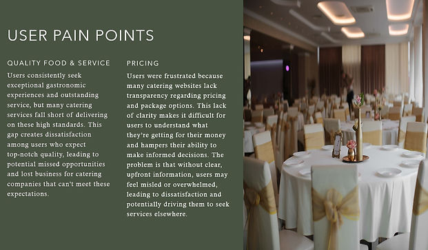
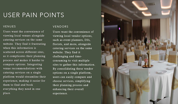
I began by interviewing three brides and two event planners to truly understand user needs in the catering market: what matters most when choosing a vendor, how they browse websites, what kind of information they expect to find. From this empathize phase I identified key pain-points: unclear pricing, hidden service details, lack of venue/partner transparency.
Competitive audit
I analyzed two local catering websites: one recognised as “Best Seattle Catering Company” and another award-winning seasonal catering service. Both offered strong visuals, but neither provided visible pricing nor a list of preferred venues/vendors — gaps I saw as opportunity.


Goal statements & design goals
I clarified our design goals and tailored my pitch to my partner, making sure it was customized to our specific needs and objectives.
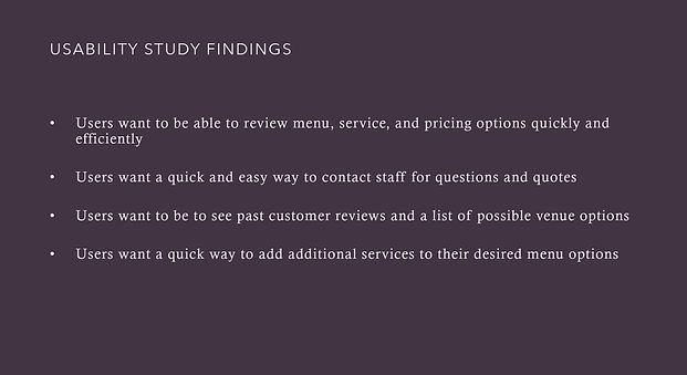
The purpose of this project is to design a tasteful and aesthetically pleasing website that allows users to:
-
Review Menu, Service, and Pricing: Quickly and efficiently access detailed information on menu options, services, and competitive pricing.
-
Contact Staff: Easily get in touch with staff for questions and quotes without hassle.
-
View Reviews and Venues: Read past customer reviews and browse a list of recommended venue options to make informed decisions.
Then I determined a value proposition to ensure that users had a reason to use the product that I was creating, as opposed to any other product currently available.


Site map / user flows
Based on insights, I crafted an information architecture that prioritized menu content and service overview, but also allowed non-linear exploration (gallery, venue list, contact form).
I drafted site maps and user flows to map how a user (bride/event planner) would navigate from landing page → menu → testimonial → contact quote.

Visual design development
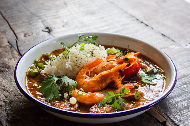
Imagine a family-owned catering company with a Creole twist, dazzling with a palette of forest green, dark purple, gunmetal green, and white. Forest green brings a splash of nature’s freshness, hinting at the high-quality, fresh ingredients used in the dishes. Dark purple adds a touch of elegance and a nod to the rich, vibrant Creole culture. Gunmetal green gives a sleek, modern edge without losing that cozy, family feel, while white provides a crisp, clean backdrop that makes key elements pop. Together, these colors create a distinctive and memorable brand that feels both sophisticated and deeply rooted in its cultural heritage, making every event a feast for the eyes and the taste buds!

Typography
Pairing Verdana and Courier New is like mixing the best of both worlds in a fun, stylish way! Verdana brings that modern, crisp vibe, making everything super easy to read whether it’s on a screen or in print. It’s approachable and friendly, perfect for keeping things fresh. Fresh typography is like the secret sauce for a catering company—it adds flavor to everything! Just as the food is creative and delicious, modern typefaces show that the brand is lively and
on-trend.
Then you have Courier New, with its classic typewriter charm that adds a cool retro twist. It’s structured, professional, and full of character. Together, they create a dynamic duo—Verdana’s sleekness keeps things clear, while Courier New adds a dash of old-school flair. It’s like having the perfect blend of modern and vintage, making your content stand out with both clarity and personality!


Imagery was curated to reflect event and catering contexts — fresh ingredients, plated dishes, lush settings, elegant table displays, and Creole influences.
Prototyping / testing / iteration
Given I was new to design, I built a working prototype directly in the Wix editor rather than code. Then I ran moderated usability sessions with the same three brides: tasks like “find menu options,” “submit a quote request,” “view venues list.”
Feedback revealed several small navigation hurdles and confusion around pricing presentation. I iterated the design: clarified call-to-action buttons, simplified page flows, improved contact forms.
 |  |  |  |  |
|---|---|---|---|---|
 |  |  |
Challenges & solutions
Challenge: Tight timeframe (only 3 days) meant limited room for perfect polish.
Solution: Focused on MVP features first (menu + contact) and layered enhancements later.
Challenge: Conveying both cultural authenticity and a premium brand.
Solution: Used color palette and typography deliberately to balance heritage and elegance.
Challenge: Ensuring usability for diverse users (brides & planners) with minimal user testing.
Solution: Ran targeted sessions, prioritized usability insights, and iterated quickly.
Deliverables
-
Live Wix website (Desktop + Mobile)
-
Style tile (Palette + Typography)
-
Site map
Outcome & reflection
The site launch resulted in major wins for the company — landing two large wedding contracts (each 170+ guests) and securing several partnerships with venues like Tibbett’s Creek Manor, Seattle Arboretum, Edmonds Yacht Club, and Lake Washington Rowing Club. Highlights include:
-
a fabulous Two-Day Grand Opening for Ambrosia Med Spa,
-
a festive Holiday Party for Renton Car Pros - Chrysler Jeep Dodge Ram, and
-
an engaging Sales Team Building Event for Attachmate.
While these wins directly impacted the catering business, the bigger outcome for me was much more personal: this project ignited my career path into UX/UI design. It showed me how a website could influence user perception, drive business results, and become a creative expression. In that sense, the design exceeded my objectives and set up the foundation for my professional growth.
Final thoughts
Looking back, this project feels like the “origin story” of my design journey. The hustle, the self-taught approach, the early mistakes and fast learning — they all shaped how I think about design today.
One key lesson: functionality matters as much as beauty — a gorgeous site means little if users can’t find the info they need. I also learned the power of rapid prototyping and user testing, even with small sample sizes.
If I were to revisit this project today, I’d expand the usability testing to a broader audience and integrate more advanced analytics to refine continuously. I still keep the spirit of Daliogne Catering in my heart: the drive to craft meaningful, elegant experiences that connect, inspire and create change.

