Elephaid Foundation
Designing for a Cause: Enhancing the App to Turn Taps into Impact
Project Type: High-Fidelity Nonprofit App Optimization (UX/UI + Interaction + Visual Design)
 |  |  |  |  |
|---|---|---|---|---|
 |  |  |  |  |
 |  |  |  |
Project overview
Elephaid Foundation is a conceptual nonprofit focused on elephant conservation and wildlife protection. When donation conversions dropped and volunteer engagement declined, I was brought in to redesign the mobile app experience. The goal was to simplify and clarify the donation flow, highlight volunteer and support options, and rebuild trust through transparency.
Role: Sole UX / UI Designer
Deliverables: Mid-fidelity wireframes, high-fidelity mockups, prototype, usability testing documentation, pitch deck
Tools: XD, Illustrator, Photoshop
Industry: Non-profit, Wildlife Protection, Sustainability, & Social Impact
Duration: 1/7/2025 – 2/19/2025
Objectives
-
Increase donation conversion rates by making the flow intuitive, trustworthy, and low-friction
-
Make volunteer opportunities and support functions more discoverable
-
Reinforce trust through transparency, clarity, and real-time feedback
-
Align every interaction with the brand’s identity and mission
Design approach
Rooted in Purpose-Led Storytelling
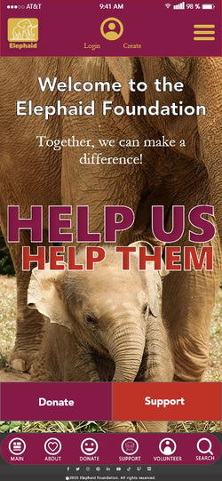
I centered the redesign around empathy, clarity, and trust. Using Elephaid’s existing brand style guide as a foundation, I leaned on earthy tones and elephant-inspired visuals to evoke connection and sincerity. The UI design prioritized readable typography, generous contrast, and clean layouts, ensuring accessibility even on smaller mobile screens. Each element — from CTA buttons to donation fields — was structured to feel intentional, logical, and emotionally resonant.

Process work
The Elephaid Foundation brand style guide played a crucial role in shaping the design, ensuring it aligned with both the client’s mission and user expectations. By following the established color palette, typography, and visual elements, the redesign maintained a consistent and trustworthy brand identity, reinforcing Elephaid’s compassionate and action-driven mission.
Mid-fidelity wireframes
I began with mid-fidelity wireframes in XD, focusing on a seamless donation process, restructuring navigation, prominent CTAs, and component consistency.


.jpg)
.jpg)
Visual design development
The Elephaid Foundation’s existing color palette and typeface choices were vital in maintaining brand consistency and user trust throughout the redesign. By using earthy tones and deep, warm hues, the design evokes a sense of nature, compassion, and urgency, reinforcing the foundation’s conservation mission. The color palette was strategically applied to enhance readability, highlight key actions (like donations and volunteering), and create a visually engaging experience.
For typography, the existing typeface choices ensured a clean, professional, and approachable look, making content easy to read across all screens. Consistent font styles were used to create a clear hierarchy, guiding users smoothly through the app while maintaining an aesthetic that aligns with Elephaid’s identity. This adherence to the established style guide helped deliver a cohesive, visually appealing, and user-friendly experience that resonates with both the organization and its supporters.

High-fidelity mockups
To bring these improvements to life, I redesigned and optimized the existing app prototype by creating a high-fidelity mockups in XD. Using the creative brief, functionality test data, and user personas, I carefully refined the prototype to enhance navigation, usability, and accessibility—all while maintaining the foundation’s established branding.
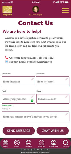
I applied key UI elements—buttons, icons, and graphics—to create an immersive yet intuitive layout, using grids and spacing to maintain consistent alignment and visual balance. To enhance interactivity, I added realistic content, imagery, and clear CTAs, making core actions like donating, volunteering, and browsing feel seamless. Accessibility guided every decision, with high contrast, readable typography, and touch-friendly design improving usability.


.jpg)
.jpg)


After finalizing the designs, I tested interactions and refined details to ensure a smooth, engaging interface ready for development and presentation.
Prototype
I added interactive elements, transforming it into a I built an interactive prototype in XD, adding tappable elements, smooth transitions, and realistic navigation flows that simulate true user interactions. Features like hover states, input fields, and confirmation messages recreated essential actions such as donating, volunteering, and exploring support options, allowing users to experience the app as they would in real use.
Usability testing
This prototype became the foundation for usability testing. I developed a test plan and script, recruited participants, and conducted moderated remote sessions to identify friction points in the donation and volunteer flows.
Based on user feedback, I refined button placement, clarified steps, and improved flow efficiency, ensuring a smoother, more intuitive experience.
Pitch deck
I also designed a comprehensive pitch deck that distilled insights from the creative brief and functionality test data into a clear, story-driven presentation. The deck outlined user personas, problem statements, and key research findings, highlighting the most critical usability challenges and how the redesigned experience directly addressed them. Each slide was crafted to show how the new design supports both user needs and organizational goals.
Presenting the project in this structured format was essential—it allowed the client to visualize the impact of design changes, understand user pain points, and see how the new experience aligns with their mission.
A well-crafted pitch deck not only communicates the value of design decisions but also builds client confidence, encourages collaboration, and supports informed decision-making for next steps.
Challenges & solutions
Challenge: Users were abandoning donations due to confusion and lack of transparency.
Solution: Simplified the donation flow into clear, linear steps. Added real-time error validation, progress indicators, and impact messages so users feel confident and assured.
Challenge: Volunteer and support functions were hidden and hard to access.
Solution: Elevated these options in the navigation and homepage, introduced modular tiles and clear CTAs, and created a discovery path so users can move from donating into deeper engagement easily.
Challenge: Maintaining brand alignment while improving usability in a highly emotional space.
Solution: Used the brand’s earthy palette, elephant themes, and type system, but kept layouts simple and focused. Ensured text contrast, legible fonts, and clear visual hierarchy to balance emotion with function.
Deliverables
-
Mid-fidelity wireframes (core flows and navigation)
-
High-fidelity mockups (donation screens, volunteer, support, home)
-
Interactive prototype (tappable flows with transitions)
-
Usability testing plan & script
-
Pitch deck to communicate design rationale and research insights
| | | | |
|---|---|---|---|---|
| | | | |
| | | |
Outcome & reflection
After redesign, the app presents a frictionless, secure, and intuitive donation experience. Clear CTAs, simplified forms, and instant feedback encourage conversions. Volunteer and support pathways are now visible, engaging, and accessible. The app now better aligns with Elephaid’s mission, helping users feel confident in contributing to elephant conservation.
Through this project, I deepened my skills in designing for social impact, balancing emotional resonance with functional clarity, and translating research into design decisions.
Final thoughts
This project reminded me that designing for good demands both heart and precision. Every screen is a chance to build trust, make giving feel effortless, and amplify purpose.
If expanded further, I’d add micro-animations for feedback cues, dashboard features for donor impact tracking, and in-app storytelling modules to connect users more deeply with Elephaid’s missions and conservation stories.
Disclaimer
The Elephaid Foundation is a nonprofit organization conceptualized by the innovative team at Southern New Hampshire University (SNHU) as part of the GRA-362 User-Centric Design course, developed solely for educational purposes. Any resemblance to real organizations, products, or services is purely coincidental. This project represents a compassionate blend of creativity and purpose—an inspired exploration of user-centered design dedicated to making a positive impact 🐘🧡.