Fernscape Interiors
Transforming Digital Spaces: Crafting an Oasis for Nature-Driven Experiences
Project Type: Web Design & Frontend Coding (UI/UX + Visual Design)
 |  |  |  |  |
|---|---|---|---|---|
 |  |
Project overview
Fernscape Interiors is a conceptual interior design brand focused on bring the beauty of nature indoors, one plant at a time. For this project, I designed a full website to reflect that mission. The goal was to translate a nature-centric interior brand into an online experience that feels warm, inviting, and authentic to Fernscape’s identity — alive, yet minimal and effortlessly usable.
Role: Sole UX / UI Designer & Web Designer
Deliverables: Low-fidelity wireframes, HTML/CSS code samples, responsive website design & development in Visual Studio Code (VS Code) & Wix
Tools: Illustrator, Photoshop, VS Code, Wix
Industry: Interior Design
Duration: 9/3/2024 – 10/24/2024
Objectives
-
Communicate Fernscape’s connection to nature, wellness, and interior design
-
Create a website that balances rich visual appeal with clarity and usability
-
Stay true to the existing brand style guide while giving the site room to breathe
-
Build responsive layouts that feel polished on any screen
Design approach
Expressed Sensory Storytelling
I grounded the visual direction in natural energy and refined minimalism. The color palette leans heavily on lush greens, accented with tangerine, black, and white — a nod to both earthiness and modern contrast. A clean sans serif typeface and structured layouts ensure clarity and readability, while imagery of plants and interiors serve as the visual anchor, creating an experience that feels fresh, calm, and thoughtfully curated.

Process work
The client's brand style guide played a crucial role in shaping the design process, providing a clear foundation for color choices, typography, and overall visual direction. By adhering to the established guidelines, the design maintained consistency with the brand’s identity, ensuring the website reflected its core values of modern elegance and natural beauty. This alignment helped create a cohesive user experience, reinforcing brand recognition while allowing for creative expression within the set parameters.
Research & discovery
The design process began with research into Fernscape's target audience: eco-conscious individuals who appreciate the aesthetic and wellness benefits of indoor plants.
Competitor analysis highlighted the need for a clean and nature-inspired interface, while feedback from potential users emphasized the importance of easy navigation and clear, engaging content.

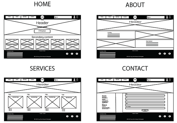
Low-fidelity wireframes
When designing the wireframes for multiple devices, I started with the smallest screen size (mobile) and scaled up, ensuring a clean structure by following Gestalt principles of hierarchy and whitespace, with clear navigation suited to mobile platforms.

Visual design development
The color palette is a breath of fresh air! The shades of green feel like a vibrant hug from nature, evoking growth, renewal, and tranquility—perfect for a brand rooted in plant life. The touches of tangerine add a sophisticated glow, whispering luxury and success without overshadowing the natural vibe. And that elegant black? It’s the grounding element that ties everything together, adding a modern, timeless edge. The palette feels intentional and welcoming, striking just the right balance between earthy warmth and refined charm. It’s a color story that tells visitors, “You’re home.”

The typography choice is like a friendly handshake—modern, approachable, and effortlessly stylish! Its rounded edges and clean lines give off a playful yet professional vibe, perfectly mirroring the balance between creativity and sophistication in their brand. It feels light and airy, making it easy to read while adding a touch of personality that says, "We're serious about plants, but we know how to have fun too!" It’s a typeface that welcomes visitors with open arms, making them feel right at home in your lush, green world.

Website layout & features
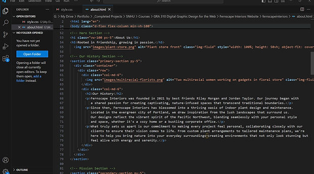
The layout was carefully crafted to provide a seamless user experience, ensuring both functionality and aesthetic appeal. The HTML and CSS code was written in Visual Studio Code (VS Code) leveraging its powerful extensions and intuitive interface to streamline the design process.
-
Mobile responsiveness: With a mobile-first approach in mind, the design was optimized to be visually stunning and function seamlessly across all devices. CSS media queries were used to adjust the layout for various screen sizes, ensuring both usability and aesthetic appeal on mobile devices.
-
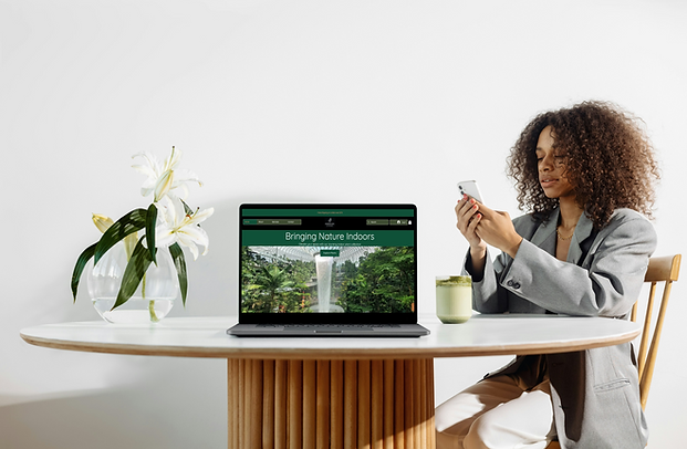
Hero section: Bold, captivating images immediately set the tone for the site, complemented by inviting headings that draw users in. CSS media queries were used to create a sleek, responsive design, ensuring the hero image adapts beautifully to any device.
-
Navigation and user journey: Designed with intuitive navigation, guiding users seamlessly from discovery to action through clear CTAs (Calls to Action) such as "Explore Plants." A sticky navigation bar, styled with lightweight yet visually appealing CSS, ensures users have easy access to key sections of the website at all times.
-
Footer design: The footer was styled with a clean, minimalistic approach, featuring social media icons and a subscription form. Flexbox was used to evenly space the icons, while hover effects were added to enhance interactivity.

Challenges & solutions
Challenge: This was my first time working in VS Code, so there was a learning curve in understanding its interface, extensions, and workflow for writing and testing custom CSS.
Solution: I approached it as a learning opportunity—researching best practices, exploring documentation, and experimenting with small styling adjustments before applying them site-wide. By the end of the project, I felt confident using VS Code to manage styles efficiently and enhance the site’s responsiveness and polish.
Challenge: With so much lush plant imagery and visual texture, the risk was a visually cluttered site.
Solution: I leaned hard into whitespace — letting imagery breathe, using clean margins, and simplifying surrounding elements so the plants take center stage.
Challenge: Balancing a strong brand aesthetic with usability and clarity.
Solution: Guided by the brand style guide, I used consistent typography, color hierarchy, and visual rules. I also ensured navigation stayed intuitive (sticky nav, clear CTAs) so style never got in the way of function.
Deliverables
-
Low-fidelity wireframes (mobile-first → desktop) for all key pages (Home, About, Services, Contact)
-
Coded website built using HTML and CSS in VS Code, featuring responsive layouts and custom styling
-
Secondary version in Wix, structured to mirror the coded build for quick viewing and client accessibility
Outcome & reflection
The final site came together as a warm, inviting online presence that mirrors Fernscape’s brand ethos. Early user feedback praised the seamless navigation, cohesive design, and engaging visuals — one viewer said it felt like “walking into a modern jungle oasis.” Even though the brand is fictitious, the project shows how design can channel atmosphere, clarity, and identity in digital form. The process sharpened my ability to translate a visual identity into a living web experience — making sure aesthetics and usability work hand in hand.
Final thoughts
This project reminded me that a website isn’t just a collection of pages — it’s an immersive expression of brand soul. Every layout choice, color contrast, and transition shapes how someone feels the moment they arrive. It challenged me to find the balance between lush beauty and functional clarity.
If expanded further, I’d explore subtle animations like parallax plant layers, add ambient motion effects, or even design a plant configurator tool to let users envision interiors with greenery in real time.
Disclaimer
Fernscape Interiors is a interior design brand conceptualized by the innovative team at Southern New Hampshire University (SNHU) as part of the GRA-310 Digital Graphic Design for the Web course, solely for educational purposes. Any similarities to real businesses are purely coincidental, and the products and services mentioned are fictional too—consider it a delightful oasis of creativity and inspiration 🌴🪴!