


Fōcus 05
Rebranding Journey: Attracting Millennials with Vibrant Subway Ads
Tools: Illustrator | InDesign | Photoshop
Industry: Accommodation & Food Services
Subway Banner Ad Campaign | Process Book
July 15 - August 12, 2024
The challenge
Fōcus 05, a bustling downtown restaurant, wanted to connect with Millennials—the vibrant, tech-savvy crowd. Their current branding and advertising resonated with Baby Boomers and Gen Xers but felt outdated and did not align with the cultural and aesthetic preferences of the younger generation. My mission? Craft a subway banner ad that screams inclusivity, adventure, and modern vibes to make Millennials feel like Fōcus 05 is their place to be.
The outcome
The final designs brings Fōcus 05’s brand to life for Millennials. The vibrant visuals, clean typography, and tech-savvy elements made the ads feel approachable and engaging. By focusing on inclusivity, technology, and fun, these designs redefines Fōcus 05 as a hub for Millennial dining and connection.
Showcased Excellence: Process Book Featured SNHU Design Thinking Course
I’m absolutely thrilled and honored to have been asked for my permission to feature my Process Book in SNHU’s GRA 280 Design Thinking for Graphic Designers course as an example of excellent work. What an exciting way to contribute to future designers’ journeys! 🎉
Process work
The approach
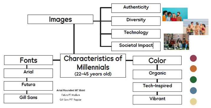
1. Human-Centered Design: The Secret Sauce
Empathy guided every step. I dove deep into Millennial preferences: vibrant colors, modern sans-serif fonts, and visuals that embrace diversity and authenticity. By analyzing their love for group activities, tech integration, and unique experiences, I built the foundation for designs that would truly resonate.
2. Feedback: The Real MVP
Iterating designs isn’t just tweaking visuals—it’s about refining connections. I embraced feedback from mock-up reviews, where I learned to ditch symmetry, replace generic icons, and focus on real, relatable visuals. The result? Dynamic layouts with left-aligned text, rich backgrounds, and authentic group imagery.

Ideate
I created three distinct mock-ups, each a unique take on Millennial engagement:
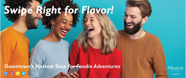
Bold & Buzzing:
Vibrant hunter green and blue hues paired with playful fonts and an image of a lively, tech-savvy group sipping drinks. This design radiates energy and social connection.
Messaging: Sip, Savor, Slay!
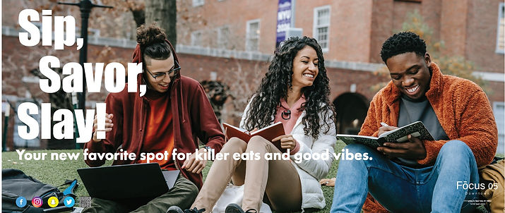
Chill & Classy:
Deep green and warm orange tones with clean, simple typography. A relaxed dining experience is showcased with drool-worthy food and friends chatting casually.
Messaging: Modern Flavors & Cozy Feels.
Unique & Tech Savvy:
A sophisticated mix of greens, oranges, and pops of magenta with sleek fonts. Featuring a person using a smartphone, this design highlighted tech-forward dining with convenience and style.
Messaging: Unique Eats, Wallet-Friendly Feasts.


Iterate
With every round of feedback, the designs grew sharper:
-
Dynamic Alignment: Goodbye, symmetry! Left-aligned layouts created a natural flow, guiding the viewer’s eye effortlessly.
-
Enhanced Visual Hierarchy: Headlines and subheads were repositioned to ensure easy readability.
-
Social Media Savvy: Updated icons for platforms like Instagram and Snapchat made connections feel modern and relevant.
-
Rich Imagery: Diverse, energetic groups replaced staged photos, amplifying the authentic, inclusive vibe.

Impact on users
End result and what my work accomplished
I’m absolutely thrilled and honored to have been asked for my permission to feature my Process Book in SNHU’s GRA 280 Design Thinking for Graphic Designers course as an example of excellent work. What an exciting way to contribute to future designers’ journeys! 🎉
Project submission feedback:
Key Takeaways
-
Empathy-driven design leads to stronger connections: By understanding Millennials’ preferences—like vibrant colors, inclusive imagery, and tech-savvy elements—I created designs that resonated deeply with their values and lifestyle. Human-centered design principles made the end result more relatable and engaging.
-
Iterative feedback sparks innovation: Incorporating feedback helped refine the designs significantly. Shifting from center alignment to left alignment, replacing generic elements with authentic ones, and enhancing visual hierarchy transformed static mock-ups into dynamic, user-friendly designs.
-
Consistency and authenticity build trust: Aligning visuals, fonts, and messaging across mock-ups created a cohesive brand experience that appealed to Millennials. By showcasing real, relatable scenarios and emphasizing inclusivity, the designs captured the audience’s trust and attention.
Disclaimer
Fōcus 05 is a fictional restaurant, brought to life by the creative minds at Southern New Hampshire University (SNHU) as part of the GRA-280 Design Thinking for Graphic Designers course, solely for educational purposes. Any similarities to real businesses are purely coincidental, and the products and services mentioned are fictional too—imagine it as a flavorful feast of creativity!