Fōcus 05 Restaurant
Rebranding Journey: Attracting Millennials with Vibrant Subway Ads
Project Type: Advertising & Brand Refresh Design (Campaign Concept + Visual Identity)
 |  |  |
|---|
Project overview
Fōcus 05 is a fictional bustling downtown restaurant that wanted to revitalize its image and appeal to a younger, Millennial audience. Their existing branding and advertising felt dated and resonated more with older generations. The goal was to design a subway banner ad campaign that communicates inclusivity, energy, and modern flair, positioning Fōcus 05 as a spot where Millennials want to gather.
Role: Sole Graphic Designer & Visual Brand Strategist
Deliverables: Mood board, mind map, three subway banner ad mockups, process book
Tools: Illustrator, InDesign, Photoshop
Industry: Accommodation & Food Services
Duration: 7/15/2024 – 8/12/2024
Objectives
-
Refresh Fōcus 05’s visual identity to better resonate with Millennials
-
Produce subway banner ads that feel modern, bold, and engaging
-
Inject authenticity and inclusivity into the visuals
-
Stand out in public transit environments while maintaining clarity
Showcased excellence
Process Book Featured SNHU Design Thinking Course 🎉
I’m absolutely thrilled and honored to have been asked for my permission to feature my Process Book in SNHU’s GRA 280 Design Thinking for Graphic Designers course as an example of excellent work. What an exciting way to contribute to future designers’ journeys!
Design approach
Embodying Cultural Storytelling
Guided by empathy and energy, I centered the visual direction on vibrant aesthetics, bold typography, and dynamic layouts. I selected palettes with greens, teals, and pops of orange or magenta to evoke fun and youthfulness. To keep balance, clean typography and contrast anchored the visuals. I aimed to strike a harmony: expressive without being chaotic, modern but still accessible.

Process work
Empathy & research
I began by researching Millennial preferences, analyzing transit advertising, restaurant branding, and youth culture trends to understand what captures attention and builds connection. Guided by empathy, I focused on what Millennials value most: vibrant color palettes, modern sans-serif typography, and authentic, diverse visuals that reflect real experiences. By tapping into their love for community, technology, and individuality, I created a design foundation that resonates both emotionally and visually.


I created three distinct concepts. Each concept included headline messaging that aimed to speak directly to a Millennial mindset:
-
Bold & Buzzing focusing on energetic colors and group imagery
-
Chill & Classy with a more refined, modern feel
-
Unique & Tech-Savvy combining sleek visuals and technology cues
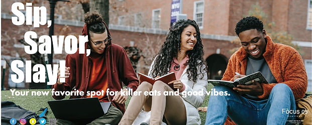
Bold & Buzzing
Vibrant hunter green and blue hues paired with playful fonts and an image of a lively, tech-savvy group sipping drinks. This design radiates energy and social connection.
Messaging: Sip, Savor, Slay!

Chill & Classy
Deep green and warm orange tones with clean, simple typography. A relaxed dining experience is showcased with drool-worthy food and friends chatting casually.
Messaging: Modern Flavors & Cozy Feels.

Unique & Tech Savvy
A sophisticated mix of greens, oranges, and pops of magenta with sleek fonts. Featuring a person using a smartphone, this design highlights tech-forward dining with convenience and style.
Messaging: Unique Eats, Wallet-Friendly Feasts.

Iteration & Refinement
Through feedback cycles, I made directional shifts:
-
Dropped strict symmetry in favor of left-aligned dynamic layouts
-
Elevated visual hierarchy to ensure legibility in transit settings
-
Swapped generic stock images for authentic, diverse group shots
-
Refined platform icons and messaging tone to feel current and inclusive
Bold & Buzzing After Iterations
Chill & Classy After Iterations

Unique & Tech Savvy After Iterations

Process book
I developed a comprehensive process book documenting each stage of the design thinking process — from empathizing with the target audience to iterating based on feedback. The book highlights my research, mockups, and final iterations, showing how human-centered design guided every decision.
This deliverable not only communicates my creative process and rationale but also demonstrates how structured reflection and iteration lead to stronger, more user-focused design outcomes.
Challenges & solutions
Challenge: Ensuring readability and visual impact in transit environments (where viewers have limited time).
Solution: I prioritized bold contrast, strong typographic hierarchy, and concise messaging so the ad could be absorbed quickly and understood from a distance.
Challenge: Making ads feel authentic, not just trendy.
Solution: I used diverse, natural imagery, avoided overly stylized graphics, and leaned into sub-cultural cues that resonate without feeling forced or cliché.
Deliverables
-
Mood board
-
Mind map
-
Three subway banner ad mockups
-
Process book documenting ideation, iteration, and rationale
 |  |  | | |
|---|---|---|---|---|
|
Outcome & reflection
The final design brought a brighter, more inclusive, and energetic visual voice to Fōcus 05. The campaign shifted perceptions—what was once seen as a traditional eat-in spot now reads as a vibrant, community-friendly venue for young people.
The work was also selected to be featured in SNHU’s Design Thinking for Graphic Designers course as exemplary process and execution.
Final thoughts
This project reinforced how branding is about resonance, not just visuals. Every design choice—from layout rhythm to imagery selection—can either invite or alienate a viewer. Reimagining Fōcus 05 challenged me to blend boldness with nuance.
If pushed further, I’d develop a cross-media rollout (social, email, murals) aligned with the subway ads, animate some elements for digital billboards, or sketch an interactive microsite that deepens the story behind the brand refresh.
Disclaimer
Fōcus 05 is a fictional restaurant concept created by the imaginative team at Southern New Hampshire University (SNHU) as part of the GRA-280 Design Thinking for Graphic Designers course, developed solely for educational purposes. Any resemblance to real restaurants, products, or services is purely coincidental. This project serves as a flavorful exploration of design thinking, branding, and visual storytelling—where creativity meets culinary inspiration 🍽️✨.