Helios
Designing for the Drive: Crafting a Safe, Intuitive, and Engaging Infotainment Experience
Project Type: High-fidelity Car Infotainment System Prototype (UI/UX + Interaction Design)
 |  |  |  |  |
|---|---|---|---|---|
 |  |  |
Project overview
The Helios Car Infotainment System project centered on creating an intuitive, high-fidelity prototype for an in-vehicle touchscreen interface. The goal was to enhance the driver experience through safe, seamless, and user-friendly interactions with navigation, media, communication, and climate controls — all while maintaining minimal driver distraction and strong visual cohesion.
Role: Sole UX / UI Designer & Researcher
Deliverables: Wireframes, design system, interactive prototype, usability testing plan
Tools: Illustrator, Photoshop, Figma
Industry: Automotive Technology / Automotive UX Design
Duration: 7/1/2025 – 8/20/2025
Objectives
-
Design an infotainment interface that’s both intuitive and distraction-free for drivers.
-
Ensure accessibility and usability across key features: navigation, media, calls, and climate control.
-
Test and validate the design through moderated usability testing with real participants.
-
Create a visually cohesive and trustworthy system that aligns with Helios’s brand identity of innovation and clarity.
Design approach
Exemplified Functional Storytelling
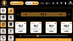
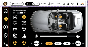
The system was structured around a five-icon left navigation — Home, Climate, Media, Navigation, and Phone — providing quick, predictable access to the Helios Car Infotainment System key functions.
Visual design
The final interface featured a clean, high-contrast color palette optimized for visibility in both bright and low-light environments. Consistent iconography, rounded controls, and a balance of touch targets supported accessibility and minimized cognitive load.
Interaction design
Primary actions (like toggling modes or adjusting temperature) were placed within thumb-reachable zones.
Secondary features were accessible in one or two taps, reducing driver distraction and cognitive effort.


Process work
The Helios client brief was essential in defining the project’s direction and design priorities. It outlined key objectives such as enhancing driver safety, reducing cognitive load, and creating an interface that balanced functionality with aesthetic simplicity. The brief also clarified target users and accessibility expectations, serving as a roadmap for every design decision. By grounding the creative process in clear user needs and measurable goals, the client brief ensured that the final prototype aligned with both brand values and real-world usability standards.
Design system
The design system served as the foundation for the Helios Car Infotainment interface, establishing clear standards for color, typography, and component behavior. By following this system, the prototype maintained visual consistency and functional harmony across all screens, reinforcing a sense of trust and ease for drivers. This structured approach ensured that every element—from icons to feedback animations—aligned with Helios’ focus on clarity, safety, and modern innovation while allowing room for creative iteration and user-centered refinement.
Site map
The project began with the creation of a site map to organize key features and navigation pathways within the infotainment system. This framework established the hierarchy of primary and secondary functions — such as Climate, Media, Navigation, and Phone — ensuring drivers could access essential controls quickly and intuitively. Mapping the structure early helped clarify task flows and guided decisions around screen layout and information placement.
Mid-fidelity wireframes
Using the site map as a blueprint, I developed a series of low-fidelity wireframes to explore layout options, component placement, and interaction flow. These early sketches focused on clarity and accessibility, emphasizing large touch targets, minimal text, and consistent icon placement to support safe in-vehicle use. The wireframes served as a foundation for testing ideas before moving into high-fidelity design, reducing the risk of usability issues later in the process.


Usability testing
A moderated usability study was conducted with 5–7 licensed drivers aged 25–65, including at least one participant with accessibility needs. Each participant completed five realistic tasks — from activating voice commands to adjusting the passenger’s seat temperature.
Key insights:
-
Participants found the navigation intuitive and the icons easy to interpret.
-
Minor hesitation was noted around toggling modes — suggesting the need for stronger affordances.
-
Users appreciated the dark/light mode toggle and consistent layout across screens.
-
Feedback emphasized that the interface felt modern, efficient, and visually balanced, with clear alignment between visual hierarchy and usability goals
Iteration process
Throughout the design process, I continuously iterated on the wireframes, incorporating feedback and usability insights to refine navigation and visual hierarchy. Each round of updates brought the interface closer to balancing simplicity with functionality, ensuring drivers could complete tasks efficiently without unnecessary visual clutter. This iterative approach helped evolve the design into a cohesive, intuitive system that aligned with both user needs and the client’s safety-focused goals.


Challenges & solutions
Challenge: Creating a design that balanced functionality, minimalism, and driver safety.
Solution: Simplified the interface hierarchy and used high-contrast visuals with large, tactile-sized buttons for faster recognition and lower visual demand.
Challenge: Ensuring discoverability of secondary features (e.g., climate sync, seat warmers) without cluttering the interface.
Solution: Used intuitive iconography, progressive disclosure, and consistent grouping to make advanced controls easy to find without overwhelming the user.
Challenge: Simulating realistic interaction flows in Figma for usability testing.
Solution: Developed fully linked prototype with micro-interactions and clear transitions, allowing participants to experience authentic navigation patterns.
Deliverables
-
Mid-fidelity wireframes
-
Design system: Built in Figma, serving as the foundation for maintaining consistency across all screens and components
-
High-fidelity mockups
-
High-fidelity interactive prototype: Designed in Figma, featuring fully functional navigation between screens, dark and light mode options, and realistic task flows
-
Usability test plan: Comprehensive documentation outlining scope, goals, methodology, KPIs, participant screening, test script, and consent protocols
| | | | |
|---|---|---|---|---|
| | |
Outcome & reflection
The usability testing validated the interface structure and interaction patterns, confirming that the system was easy to navigate and comfortable to use under time pressure. The final design achieved a strong balance between aesthetics, usability, and safety, embodying Helios’s mission to simplify the driving experience through technology that feels both intelligent and human.
Through this project, I strengthened my skills in usability testing, prototype realism, and data-driven iteration — translating user insights into actionable design refinements that directly improved clarity and flow.
Final thoughts
Designing for the Helios Car Infotainment System reminded me that great design isn’t just about how it looks — it’s about how seamlessly it fits into people’s lives. In a space where safety meets innovation, every interaction has purpose. Creating a system that helps drivers stay connected without distraction reinforced that intuitive design is ultimately about trust and focus behind the wheel.
If expanded further, I’d explore fully functional voice-assisted features, adaptive UI modes for different driving conditions, and personalized driver profiles to make the system even more intelligent and user-centered.
Disclaimer
Helios is a fictional automotive technology brand developed by the creative minds at Southern New Hampshire University (SNHU) as part of the GRA-368 Prototyping & Optimization in User Experience Design course, designed solely for educational purposes. Any resemblance to real companies, products, or technologies is purely coincidental. The concepts and interfaces presented are entirely imaginative—think of it as a sleek fusion of innovation and design brilliance 🚘🖥️.