Piddle Paddle Tours
Showcasing Adventure: Designing Captivating Print Brochures
Project Type: Print & Marketing Design (Brochure Layout + Visual Storytelling)
 |  |
|---|
Project overview
Piddle Paddle Tours, a leading provider of ocean-based activities, wanted to attract a diverse audience with brochures showcasing their exciting offerings. These included whale watching, snorkeling with stingrays, turtle nesting tours, and fishing excursions. The goal was to convey adventure, discovery, and family-friendly fun while maintaining a professional yet inviting tone.
Role: Sole Graphic Designer
Deliverables: Brand identity assets (color palette, typographic system), print-ready files (tri-fold & half-fold brochure designs)
Tools: InDesign, Photoshop
Industry: Tourism & Ecotourism
Duration: 10/29/2024 - 12/14/2024
Objectives
-
Develop a visually engaging brochure series that reflects the brand’s outdoor adventure theme.
-
Communicate tour details and contact information in a clear and approachable layout.
-
Maintain brand consistency across both tri-fold and half-fold formats.
-
Ensure the final designs were print-ready and optimized for readability and professional production.
Design approach
Experiential Storytelling
The design approach focused on blending vibrant imagery, natural color tones, and organized layouts to create an inviting, adventure-driven aesthetic. The serif fonts paired beautifully with the nature-inspired color palette and rich photography, reinforcing the brand’s connection to the outdoors. Ample white space and consistent margins helped balance the energetic visuals with a structured presentation, making the content easy to follow. Each brochure was designed to guide the reader’s eye through a clear visual flow — from captivating tour imagery to essential details and contact information. This approach ensured that the materials not only looked dynamic but also functioned as effective marketing tools that inspired confidence and curiosity.

Process work
The client’s existing logo served as the anchor for the brochure designs, establishing a clear direction for color, typography, and overall visual tone. By following the brand’s playful yet professional identity, the layouts captured the spirit of adventure, family fun, and discovery that define Piddle Paddle Tours.
This consistency ensured every brochure felt cohesive and on-brand while still leaving room for creative exploration through dynamic imagery and engaging composition.

Visual design development
For the Piddle Paddle Tours’ brochures, I aimed for a color palette and typography that capture the brand's family-friendly, seasonal, and nautical spirit while reflecting the charm of Alabama’s Gulf Coast and the natural beauty of whale watching and historical landmarks.
This palette is a harmonious blend of warmth and vibrancy, radiating positivity and charm. Each hue tells a story, from the grounding and earthy tones that evoke stability and comfort to the pops of bold, lively colors that inject energy and excitement.

Typography played a key role in making the brochures both eye-catching and easy to navigate. For the headlines, Adobe Jenson Pro brought a touch of timeless elegance, drawing attention to the most important sections.
Paired with Civane for the body text—a modern, clean sans-serif font—the design struck the perfect balance between sophistication and approachability. The contrast between these fonts created a dynamic reading experience that was engaging and visually appealing.


Tri-fold brochure
The tri-fold brochure was designed to pack a wealth of information into a compact, easy-to-carry format, perfect for tourists on the go. Each panel was strategically arranged to guide readers through a seamless journey—from the captivating cover to the engaging tour details. Stunning visuals, such as breaching whales and picturesque lighthouses capture attention and spark excitement. This format strikes a balance between detailed content and sleek design, ensuring it remains informative, engaging, and intuitive, while perfectly reflecting the adventurous spirit of the tours.
Half-fold brochure
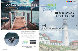
The half-fold brochure was crafted to deliver an impactful yet simple presentation, focusing on fewer, high-impact elements. With its spacious layout, this format was ideal for showcasing breathtaking visuals and concise, engaging descriptions of their offerings. The design highlighted key attractions—such as the Rockaway Lighthouse and fishing excursions—while using bold headlines and clean typography to ensure readability. This format offered a big-picture overview, perfect for grabbing attention and leaving a lasting impression. Its open, airy design invited readers to explore the content effortlessly, making it a standout promotional piece that balanced clarity with visual appeal.
Challenges & solutions
Challenge: Creating a brochure design that captured the excitement of outdoor adventure while maintaining a professional, trustworthy brand image.
Solution: I balanced bold, nature-inspired imagery with clean typography and structured layouts, allowing the design to feel both energetic and polished — appealing to adventure seekers and families alike.
Challenge: Organizing detailed tour information without overwhelming the reader.
Solution: I implemented a clear visual hierarchy using consistent heading styles, icons, and spacing to guide the viewer’s eye naturally through key details such as pricing, locations, and contact information.
Challenge: Ensuring visual consistency between multiple brochure formats (tri-fold and half-fold).
Solution: I established a cohesive color palette and typographic system that unified both designs, creating a recognizable and harmonious brand identity across all materials.
Challenge: Printing accuracy and readability across various paper types and finishes.
Solution: I created print-ready files with precise margins, bleed, and trim marks, and tested color contrast to ensure imagery and text remained vibrant and legible after printing.
Deliverables
-
Brand identity assets (color palette, typographic system)
-
Print-Ready Files (tri-fold & half-fold brochure designs) – Prepared production-ready layouts with bleed, trim marks, and print specifications for professional output
| |
|---|
Outcome & reflection
The final brochure designs successfully captured Piddle Paddle Tours’ adventurous and nature-driven spirit while maintaining a clean, professional aesthetic that appealed to eco-conscious travelers. By combining vibrant imagery with clear typography and structured layouts, the materials effectively balanced visual appeal with readability, allowing users to easily explore tour options and essential details. The result was a cohesive set of marketing materials that reinforced brand identity, encouraged engagement, and built excitement around the outdoor experiences offered.
This project strengthened my understanding of how visual hierarchy and color psychology can guide attention and evoke emotion. It also reaffirmed the value of clarity, consistency, and storytelling in print design — transforming simple brochures into tools that connect audiences to the brand’s mission of adventure and sustainability.
Final thoughts
This project reminded me that great print design is about more than just layout — it’s about capturing the essence of a brand through visual storytelling. Every design choice, from the color palette inspired by nature to the balance of imagery and typography, was made to reflect the excitement and serenity of outdoor adventure. It deepened my appreciation for how thoughtful composition and hierarchy can guide a reader’s journey while reinforcing brand authenticity. Above all, it reinforced my belief that effective design should inspire connection and curiosity, inviting people to explore the world one paddle at a time.
If expanded further, I’d explore creating a coordinated print and digital campaign—including social media visuals, interactive maps, and promotional postcards—to extend the brochure’s storytelling across platforms. I’d also integrate a QR code that links directly to tour booking pages or video highlights, enabling readers to instantly book or explore experiences—enhancing convenience, interactivity, and engagement with Piddle Paddle Tours’ adventurous brand.
Disclaimer
Piddle Paddle Tours is a fictional sea adventure and tour company created by the imaginative team at Southern New Hampshire University (SNHU) as part of the GRA-350 Layout & Publication Design course, developed solely for educational purposes. Any resemblance to real businesses, products, or services is purely coincidental. This project serves as a vibrant exploration of branding and design—an adventurous voyage into creativity and visual storytelling 🐋🐢.