RavenSkye Crystals
Crafting Unique Experiences: From Creative Concepts to Digital Mastery
Project Type: Web & Mobile Design + Digital Branding (E-Commerce Experience)
 |  |  |  | |
|---|---|---|---|---|
 |  |  |  |  |
 |  |  |
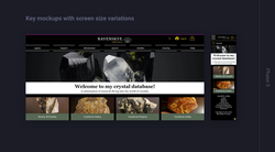
Project overview
RavenSkye Crystals is a passion project of mine. With over 350 crystals in my own collection, I noticed my existing site lacked an intuitive, immersive experience for visitors who love both the metaphysical and the visual beauty of crystals. My goal was to design a user-centered, visually rich e-commerce platform and supporting brand identity that aligns with the aura of the crystal world while making shopping, browsing, and learning seamless.
Role: Sole UX/UI designer & Branding Specialist
Deliverables: Brand identity assets (logo, color palette, typographic system), website + Android & iOS mobile app design (wireframes, prototypes), business cards
Tools: XD, Figma, Pitch, Wix
Industry: Retail Trade - Gemstone & Crystal
Duration: 6/16/2022 – present
Objectives
-
Craft a site experience that blends education, wonder, and commerce
-
Make crystal browsing and research intuitive and inspiring
-
Design a cohesive brand identity that feels mystical but trustworthy
-
Ensure responsive, accessible, and scalable design across devices
Design approach
Rooted in Intuitive Storytelling
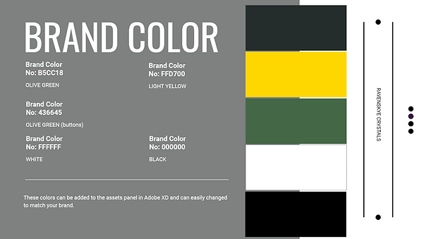
I anchored the design around emotional resonance and clarity. I leaned into a palette inspired by nature (olive green, subtle gold, black, white) to feel grounded yet luminous. Typography would need to be graceful and readable. In visuals and layout, I prioritized space, contrast, and hierarchy so crystals remain the stars of the show. And above all, the experience had to feel magical but usable.

Process work
Interviews
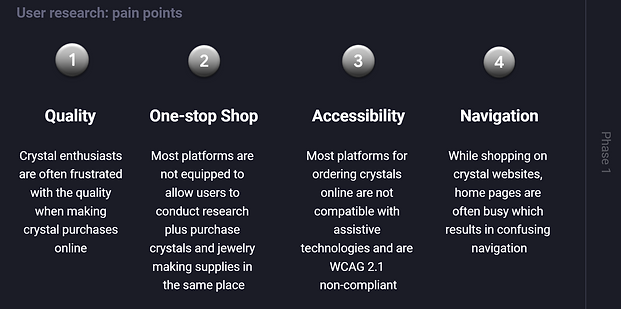
The design process for RavenSkye Crystals began with research and empathy. I conducted interviews with crystal enthusiasts and collectors to understand their behaviors, frustrations, and goals when browsing online crystal shops.
Insights revealed a clear pattern: users wanted a space where they could easily explore, learn, and purchase crystals without feeling overwhelmed or uncertain about authenticity.
Competitive audit
I conducted product feature and competitive audit of direct and indirect rivals (Crystal Council, Sage Crystals, The Citrine Circle, and Crystals and Jewelry). I put together a list of features and UX elements that would be super useful for consumers including: User interface, images, filters/search, sorting, and responsiveness.


Crystal Council and Sage Crystals stood out as the top picks from the four options, offering a solid crystal knowledge base—but I did spot a few weaknesses. I summarized my findings in a competitive audit report.
Goal statements & design goals
I used insights gathered from user research and competitive analysis to begin generating ideas. I applied ideation techniques such as “How Might We” and Crazy Eights to explore potential solutions from multiple perspectives:
-
Amp up the good: How might keep users engaged while providing both research and shopping functionality?
-
Change the status quo: How might we help users with accessibility challenges as they work toward their goals?
-
Break the point-of-view into pieces: How might we encourage ongoing engagement and interaction with the crystal database?
From there, I defined a clear goal statement outlining the product’s purpose and identified the top three design goals to guide development.


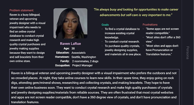
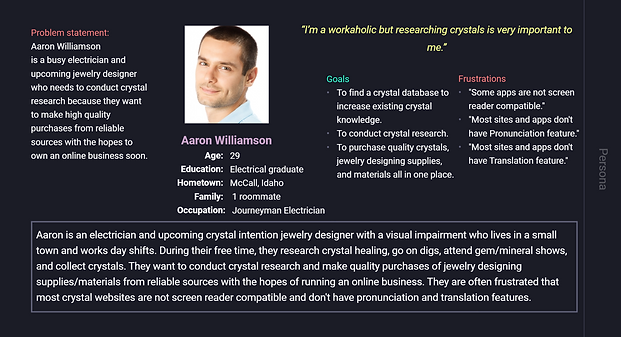
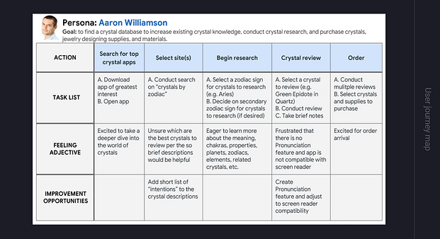
I created problem statements, personas and journey maps to tell the user's story, build empathy, and put my design to the ultimate test.

Value proposition
I determined my value proposition to ensure that users have a reason to use the product that I am creating, as opposed to any other product currently available.

User flow & sitemap
I created a detailed user flow and sitemap to establish clear pathways for key tasks and organize the site’s information architecture before moving onto wireframing.


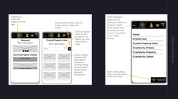
Ideation & concept development
I sketched paper wireframes for both desktop and mobile to shape the core user flows, including the home page, crystal directory, product detail, and cart. During this process, I explored multiple layout variations for the home screen—focusing on user motivations and pain points, particularly accessibility, navigation, and search functionality.


Visual design development
The website bursts with the lively energy of olive green, yellow, white, and black. Olive green brings a touch of nature’s tranquility, perfectly framing the crystals in a fresh and inviting way. Yellow zips in with a vibrant splash of fun, making key elements pop and adding an extra sparkle to the design. Using white text on a black background creates a striking and sophisticated design with excellent readability. This classic palette adds a touch of elegance and makes both the text and crystal images stand out, grabbing visitors' attention. The combination delivers a sleek, modern aesthetic that remains stylish over time, while the high contrast ensures a memorable visual impact, showcasing the beauty of the collection effectively.
Georgia, a classic serif font, adds a splash of elegance and sophistication that perfectly matches the sparkle of the crystals. Its easy-to-read design ensures that visitors can effortlessly dive into all the dazzling details of the collection, without any eye strain. Georgia’s graceful style brings a touch of old-school class while balancing beautifully with the crystal images. It is both professional and inviting, keeping everyone engaged and enchanted by the gem collection. Plus, with its consistent look across devices, the crystal showcase shines just as brightly no matter where it is viewed.

Digital wireframing
I transitioned my sketches to digital to tackle user pain points, enhance the overall experience, and gather feedback on the layout. I started by designing screens for the main user flows, refined them for better accessibility, and revisited Gestalt Principles to ensure they were well-integrated:
-
Similarity
-
Proximity
-
Common region
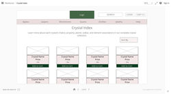
To accommodate users on various devices, I also mapped out responsive layouts for seamless browsing and searching. Here are a few samples or view the set of digital wireframes.
Easy navigation was crucial, so I focused on prioritizing call-to-action buttons and strategic placement of visual elements on the home page to make the user experience smooth and intuitive.
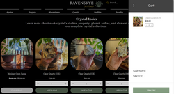
 |  |
|---|---|
 |  |
 | 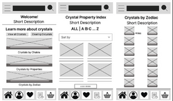 |
 |  |
Prototyping
I turned the digital wireframes into a low-fidelity prototype, linking screens for the main user flow of adding a crystal to the cart and checking out.

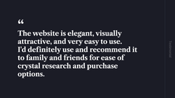
Planning the usability studies
Before diving into usability studies, I set up a note-taking spreadsheet to keep my observations organized and crafted a UX research study plan.
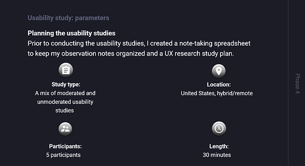
Planning the usability studies
Before diving into usability studies, I set up a note-taking spreadsheet to keep my observations organized and crafted a UX research study plan.
Testing
After gathering data from the usability studies, I used affinity mapping to synthesize the identified pain points, grouping them under common themes and features. From these themes, I drew actionable insights, emphasizing a deep human-first approach in all product work.

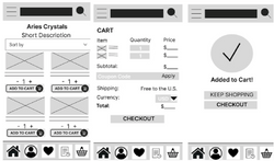
High-fidelity mockups
I transformed the low-fidelity prototype into polished, high-fidelity mockups and refined the design to better align with real user behaviors and needs uncovered through feedback.
 |  |
|---|---|
 |  |
 |  |
 |  |
 |  |
Style tile
I then created a style tile in Figma. To draw users in, I focused on the emotions I wanted them to feel while engaging with the website. Inspired by nature, I chose shades of green to symbolize renewal, growth, and peace. Light yellow (gold) adds a touch of luxury, success, and triumph, while black brings an element of elegance. These three colors became the cornerstone of the design.

Developing the high-fidelity designs
I then transformed the mockups into a high-fidelity prototype in XD, focusing on enhancing accessibility. I laid out the mockups, connected the screens, added interaction details, adjusted the animations, and repeated the process for all screens to ensure a seamless user experience.

Challenges & solutions
Challenge: Balancing the mystical aesthetic with usability (some design ideas risked being overly ornamental).
Solution: Maintained a grid and hierarchy system so visuals could breathe. Ornamentation was used sparingly, and core interactions — buttons, filters, navigation — stayed clean and clear.
Challenge: Diverse user goals — some want to shop, others to research, others to browse.
Solution: Designed multiple paths: a crystal index (by type/property), filtering shortcuts (by zodiac, chakra), and a quick preview mode so users could browse without leaving context.
Challenge: Accessibility and contrast in a design with dark and mystical tones.
Solution: Tested color contrast extensively, used high-contrast text over imaging, ensured tap targets and readability for users with vision sensitivity.
Deliverables
Research & Strategy
-
Competitive Audit Report – Analyzed key competitors’ strengths, weaknesses, and user experiences to identify opportunities for differentiation.
-
UX Research Study Plan – Defined research goals, user recruitment strategy, and testing methodology to guide design decisions.
-
Site Map – Defined the content hierarchy and navigation structure to support intuitive user journeys.
Branding & visual identity
-
Brand identity assets – Logo suite, color palette, and typographic system establishing a cohesive and recognizable brand presence.
Digital product design
-
Website + Mobile App Design – Wireframes, mockups and interactive prototypes (Android & iOS) illustrating core user flows and responsive layouts.
Marketing Collateral
-
Business Cards – Designed print-ready assets aligned with brand identity for professional networking and outreach.
-
Etsy Shop – Created an online storefront concept to extend the brand experience and showcase product offerings across digital and e-commerce channels.


Outcome & reflection
The redesign transformed RavenSkye Crystals into a more immersive, trustworthy, and functional platform. The new site harmonizes the emotional allure of crystals with the clarity users need to explore and purchase. Though it’s part passion project, it reflects a professional caliber of UX design, brand cohesion, and visual storytelling. The process sharpened my ability to balance artistry + usability, and deepened my sensitivity to how design choices influence mood, trust, and conversion.
Note: The site is currently live and viewable under a free hosting account, serving as an active work-in-progress. Once updates are complete, it will transition back to its custom domain — the same one featured on the business cards.
I completed the mobile app design on November 1, 2022, and launched the full end-to-end redesign and implementation of the RavenSkye Crystals website on June 4, 2023. The website is still live but under a free account for viewing only.
I designed the new business cards on July 13, 2023. Since then, it’s become an ongoing passion project — I’m continuously adding my new crystals, refining layouts, and expanding features as the collection and community grow. Once the updates are completed, the website will transition back to it's own domain as seen on the business cards.
Final thoughts
This project reinforced that design isn’t just visual — it’s emotional architecture. Every color shift, layout decision, and interaction influences whether someone feels curious, confident, or inspired to explore. Rebuilding RavenSkye Crystals reminded me how meaningful it is to design with heart for a space I truly care about.
If expanded further, I’d explore 360° view feature or augmented reality crystal previews, pronunciation feature, translation feature, motion and micro-interactions (hover effects, transitions), and community-driven features like crystal journaling or user galleries to deepen engagement and connection.