Sustain-A-Look
Revamping for Impact: Creating a Sustainable, Intuitive, and Beautifully Branded Fashion Platform
Project Type: Web Redesign & E-commerce (UX/UI + Visual Design)
 |  |  |  |  |
|---|---|---|---|---|
 |  |  |
Project overview
Sustain-A-Look is a conceptual sustainable fashion brand dedicated to reducing environmental waste and combating unethical labor practices through eco-friendly, fair-trade, high-quality apparel. As the brand prepared to expand beyond its local market, it needed a website redesign that would reflect its mission, enhance usability, and deliver a seamless, accessible shopping experience that appeals to ethical consumers nationwide.
Role: Sole UX / UI Designer
Deliverables: Website audit report, high-fidelity prototype (including new page build outs), project report, client presentation
Tools: XD
Industry: Fashion & Apparel
Duration: 5/5/2025 – 6/22/2025
Objectives
-
Communicate the brand’s sustainability mission and ethical values.
-
Create a seamless and accessible e-commerce experience.
-
Address user feedback by improving navigation, readability, and product filtering.
-
Design new pages for the Recycled Program and Charity Partnerships.
-
Strengthen brand recognition through cohesive visual design and usability improvements.
Design approach
Grounded in Conscious Storytelling
I approached the Sustain-A-Look redesign with a focus on clarity, consistency, and conscious design — ensuring the visual language reflected the brand’s eco-friendly values while creating a smooth, intuitive shopping journey. The color palette drew inspiration from natural materials and earth tones, evoking a sense of calm and sustainability. Accessibility remained a key priority — with high contrast ratios, legible typography, and intuitive navigation patterns ensuring the experience was welcoming to all users. The overall design direction combined ethical elegance with modern simplicity, helping Sustain-A-Look build credibility and trust with environmentally conscious shoppers.

Process work
The Sustain-A-Look client brief and brand style guide were essential in shaping the project’s direction and design priorities. They outlined key objectives such as improving navigation, enhancing accessibility, and creating a cohesive online experience that reflected the brand’s sustainable values. The brief also clarified the target audience — environmentally conscious shoppers — and emphasized the importance of transparency and trust in every interaction. Grounded in these user-centered goals, the design process focused on aligning aesthetics, functionality, and ethical storytelling to deliver a website that felt both purposeful and intuitive.
Research & insights
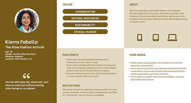
Through user personas and journey maps, I identified major usability issues on the existing site. Users like Kierra (a sustainability advocate) and Sunny (a social influencer) reported challenges such as mislabeled navigation links, lack of filtering options, low color contrast, and missing order details on the checkout page.
These insights informed a new, user-centered navigation structure and clearer visual hierarchy to improve flow, legibility, and consistency across the website.


Website prototype audit
The design process began with a detailed website audit report to assess the usability, visual hierarchy, and accessibility of the existing site. This analysis identified key problem areas such as inconsistent navigation, poor contrast, and limited product visibility — insights that directly informed the redesign strategy.
High-fidelity prototype
Using insights from the audit report, I designed a high-fidelity interactive prototype in XD that brought the redesigned Sustain-A-Look website to life. The prototype focused on creating an intuitive navigation structure, improving readability, and reinforcing the brand’s sustainable aesthetic. Through refined color choices, simplified navigation labels, and updated product layouts, the design achieved a cleaner, more cohesive, and engaging e-commerce experience aligned with the brand’s ethical values.

Navigation & content structure improvements
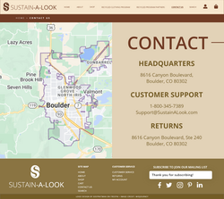
One of the first major updates focused on improving how users find, scan, and understand content through clearer organization, consistent navigation, and cohesive visual design. To achieve this, I ensured the top-level navigation remained consistent across all pages and updated navigation labels to align with industry standards and user expectations — for example, renaming:
-
“Sustain-A-Look” to “About”
-
“Locate” to “Contact Us”
-
“Marketplace” to “Shop”
I also standardized heading styles throughout the site to create a predictable content hierarchy, making information easier to scan and comprehend. Additionally, I unified CTA button styles — including shape, size, padding, and color — to establish a cohesive and reliable interface that supports a smoother, more intuitive user experience.
Usability enhancements
To support smoother user journeys and reduce friction during key tasks, several usability enhancements were introduced. A cart preview and checkout summary were added to help users easily review their order details before finalizing a purchase. A "Continue Shopping" button was also included on the Checkout page to keep users engaged and maintain a natural shopping flow.

Home page improvements
One of the first major updates was simplifying the page. The original version felt cluttered, with redundant elements like "Shop by Category" and "Contact" sections that were already accessible through the main navigation. This repetition made the layout feel busy and distracted from the brand’s core messaging. To declutter the page and create a smoother browsing experience, I removed these sections and streamlined the content to focus on the brand story and values.
Additionally, I introduced quick links and anchor tags that allow users to jump directly to key sections such as "Our Story & Impact," "Recycled Clothing Program," and "Customer Reviews."
These updates improved scannability, reduced visual noise, and helped users navigate the page more intuitively. Here's the before then after.


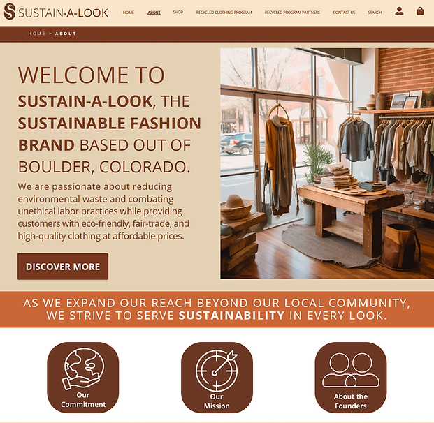
About page improvements
I renamed the "Sustain-A-Look" page to "About" to create a clearer and more familiar entry point for visitors seeking information about the brand. The original page layout lacked visual hierarchy and didn’t effectively communicate the company’s story or values. In the new version, I introduced a more balanced composition with distinct sections for the brand’s mission, vision, and founders. These changes transformed the page from a static introduction into a more engaging and informative experience that aligned with the brand’s voice and overall redesign goals. Here's the before then after.

Shop page improvements
I redesigned the “Marketplace” page, renaming it to “Shop.” The original title felt impersonal and inconsistent with the brand’s approachable tone, while “Shop” provided a more intuitive and action-oriented label. Within the new Shop page, I reorganized the layout to include options for users to Shop by Category or filter products by color, size, or type. This improved discoverability, giving visitors clear pathways to find what they were looking for without unnecessary scrolling or confusion. Here's the before then after.


On the Product page, I introduced several key updates to improve usability and visual consistency. A new header was added to establish hierarchy and help users quickly identify the page context. I incorporated a “Continue Shopping” button to encourage multi-item purchases and reduce checkout friction. I standardized the button styles to maintain a cohesive and predictable interface throughout the site.
Additionally, I removed the "Customer Reviews" section, as it duplicated content already featured on the "Home" page. This refinement helped declutter the layout, allowing the product information and imagery to stand out while keeping the page streamlined and user-focused.


The Checkout page underwent a complete redesign. The original version lacked consistency and an Order Summary. In the prototype, I rebuilt the layout to introduce clear grouping for Billing and Details and Payment Method. The “Place Order” and new “Continue Shopping” buttons were made more prominent and visually distinct to guide users toward their next action, while a review summary section was added to let them verify order details before final submission.


New page creation
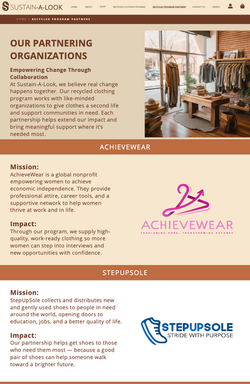
I then created two new required pages — "Recycled Clothing Program" and "Recycled Program Partners" — to highlight Sustain-A-Look’s sustainability initiatives and community impact. Using the body copy and media provided by the client, I designed layouts that balanced informative content with visual storytelling.
The "Recycled Clothing Program" page introduced users to the brand’s garment recycling process and encouraged participation through clear calls-to-action and supporting imagery.
The "Recycled Program Partners" page showcased the organizations the brand collaborates with, using a grid-based layout and consistent photo treatments to maintain visual harmony. Together, these pages deepened the brand’s narrative and reinforced its commitment to ethical, eco-conscious fashion.


Documentation creation
To document the creative and strategic rationale behind each design decision, I developed a comprehensive project report detailing the redesign objectives, methods, and outcomes.
The final client presentation summarized these findings and demonstrated how the proposed design addressed the client’s goals of usability, accessibility, and brand alignment.
Challenges & solutions
Challenge: The original website lacked visual hierarchy and intuitive navigation, making it difficult for users to locate essential pages or understand the site’s structure.
Solution: I reorganized the navigation system for greater clarity. Consistent top-level navigation and updated labels improved orientation and aligned with user expectations.
Challenge: The site’s overall interface lacked cohesion, with inconsistent button styles, duplicate content, and poor visual contrast.
Solution: I standardized the color palette, typography, and button styling to create a unified visual identity and removed repetitive content. These refinements enhanced consistency, usability, and professionalism across the site.
Challenge: The brand’s sustainability initiatives were underrepresented, limiting opportunities for storytelling and engagement.
Solution: I created two new pages — “Recycled Clothing Program” and “Recycled Program Partners” — using client-provided media and copy. These pages visually communicated the brand’s mission, reinforced transparency, and helped users connect emotionally with Sustain-A-Look’s values.
Deliverables
-
Website Audit Report of the original site’s usability, accessibility, and visual design
-
High-Fidelity Interactive Prototype showcasing updated navigation, layout, and branding
-
New Recycled Clothing Program Page highlighting garment recycling initiative and sustainability goals
-
New Recycled Program Partners Page featuring organizations collaborating with Sustain-A-Look
-
Project Report outlining the design process, rationale, and implementation strategy
-
Client Presentation summarizing audit findings, design decisions, and usability improvements
Outcome & reflection
By addressing key pain points uncovered in the audit, the redesign transformed the site into a platform that not only improved functionality but also authentically reflected the company’s commitment to ethical fashion. The updated navigation, consistent visual design, and reorganized product structure enhanced usability and accessibility, while the new "Recycled Clothing Program" and "Recycled Program Partners" pages strengthened the brand’s storytelling and transparency.
Through this project, I strengthened my skills in usability testing, visual consistency, and information architecture — translating user feedback into targeted design refinements that improved navigation clarity, brand cohesion, and overall shopping flow for Sustain-A-Look’s website.
Final thoughts
Designing the Sustain-A-Look website reminded me that great design goes beyond aesthetics — it’s about clarity, connection, and conscious intention. Every decision, from simplifying navigation to amplifying the brand’s sustainable mission, was made to create a seamless experience that feels as authentic as the company’s values. This project deepened my appreciation for designing with empathy and purpose — crafting digital spaces that function beautifully while inspiring trust, awareness, and positive change.
If expanded further, I’d explore interactive sustainability storytelling, such as animated impact visuals or a product lifecycle tracker, allowing users to see the tangible effects of their purchases. I’d also consider developing a community hub where customers could share styling tips and eco-friendly practices, extending Sustain-A-Look’s mission beyond the store into everyday life.
Disclaimer
Sustain-A-Look is a fictional brand developed by the talented design team at Southern New Hampshire University (SNHU) as part of the GRA-366 Collaboration in User Experience Design course, created solely for educational purposes. Any resemblance to actual companies, products, or services is purely coincidental. This project serves as a creative exploration of sustainable fashion branding and digital design—an inspired showcase of imagination, strategy, and eco-minded creativity ♻️👚.